news
Poorani Balendra
Cyces is just five. And until now most of our business came via referrals. About a year ago, we decided it was time to set up a marketing function and establish our brand online. And we wanted a website up and running quickly. A notion website built on top of super.so worked quite well for us. The marketing team could manage the website without depending on developers.
After 10 months, we outgrew it, we were facing some indexing issues and we were leaving a lot of traffic on the table. Cyces was also in the middle of an identity exercise as a company, putting down our core values and mission.
The easiest way would be to do a Webflow site, use a template and put a website up in a week. In fact, we did that too. But it did not inspire. We were making a mistake, and thinking of yet another stop-gap solution.
We took a step back and realized we needed to put more thought into building the website.
So, as with anything in Cyces, we started with the question: What problems are we trying to solve?
We started with ‘Inspiring the team’. Our website is also a means of communication to the team. And if we had to tell a story to the world, it had to start with the team.
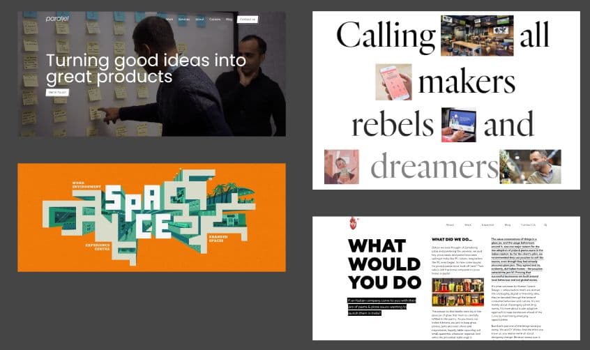
And it had to be authentic. We had a small mood board.
In the Cyces logo, there is a dot at the end. Once, an intern asked me what the dot meant, and our founder said: “It’s just that, the dot”, which meant we were a no-nonsense tech team.
Our designer then started playing around with the ‘no-nonsense’ identity.
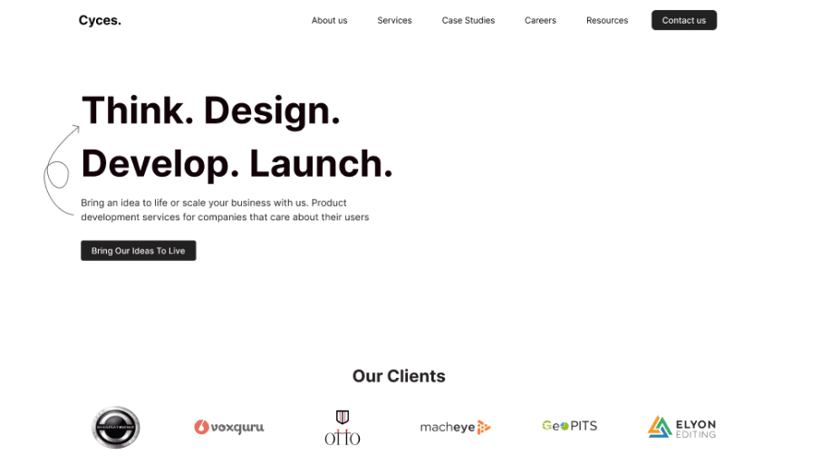
This was not working, it was not aspirational enough. We then turned to our recently published ‘Operational Principles’. One of them is: Dare mighty things. The phrase was actually engraved in NASA’s Mars Rover. It was originally uttered by Theodore Roosevelt: “Far better is it to dare mighty things, to win glorious triumphs, even though checkered by failure... than to rank with those poor spirits who neither enjoy nor suffer much, because they live in a gray twilight that knows not victory nor defeat.”
It had made it to our Operational Principles after a teammate suggested it.
Our designer then riffed off ‘Dare mighty things’ and gave us some first-looks. We loved the direction, so we decided to stay on this track.
Talking to the right audience: We needed to show proof of work, and that should speak for itself. We wanted to build an impact-first website that founders and CTOs can quickly scan.
Push design and technical standards: One of our Webflow designers showed us Relume’s website, it was a Bento design taking the design world by storm. We loved it! It forced us to think about landing pages from the ground up.

But we did not want to jump on it just because it was trending. Our primary aims of designing for the target audience and inspiring the team needed to be met.
We decided to test out Bento. It was a one-shot landing page. There was no space for fluff, so it would work for our audience. And as for inspiration, our designer gave us some options:
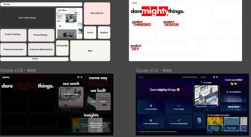
And it all started coming together. There was a lot of debate about using the color Red, but it won at the end!
Here is the look of the final landing page, and the website is now live at ! It’s custom built on NextJS by our developer.
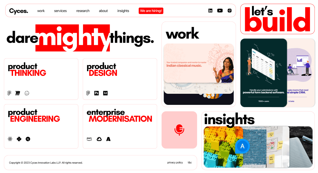
A lot of hours went into designing that CTA ‘Let’s build’ :)
Many micro-animations are on the way, we hope to delight you, as always.
leveraging tech for
business growth
Cyces.