design
Kalidass Rajasekar
As designers, we are more focused on optimizing experiences and reducing friction while designing. Friction in UI/UX design has long been seen as a hurdle to be overcome. Designers strive to create seamless, frictionless experiences for users, aiming to reduce barriers and streamline interactions. However, this focus on reducing friction often overlooks the nuanced role that friction can play in shaping interactions and enhancing overall user behavior.
While reducing friction is crucial in many scenarios, there are instances where increasing friction intentionally can be highly beneficial. This dual nature of friction, encompassing both negative and positive aspects, forms the basis of a better approach to UI/UX design.
Positive friction acts as a guiding hand, nudging users towards desired actions while empowering them with knowledge and control. Interactive tutorials, progress indicators, and delayed gratification techniques are examples of positive friction that enhance engagement and facilitate informed decision-making.
On the other hand, negative friction strategically introduces hurdles or delays to deter undesirable behaviors or prevent errors. Verification processes, confirmation prompts, and limited access to sensitive features are instances where negative friction is crucial in ensuring security, accuracy, and responsible user interactions. Balancing these friction elements in design optimizes user experiences and cultivates a sense of trust, empowerment, and engagement within digital platforms.
Negative friction is more desirable as it actively discourages undesired behaviors, enhances security, and promotes responsible user actions.
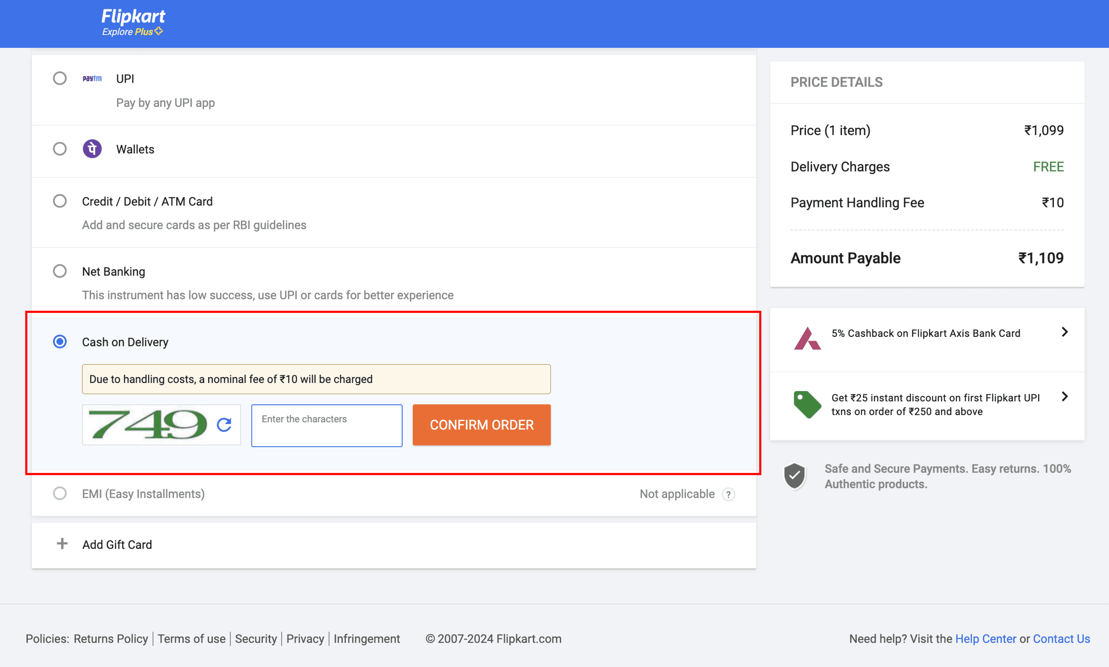
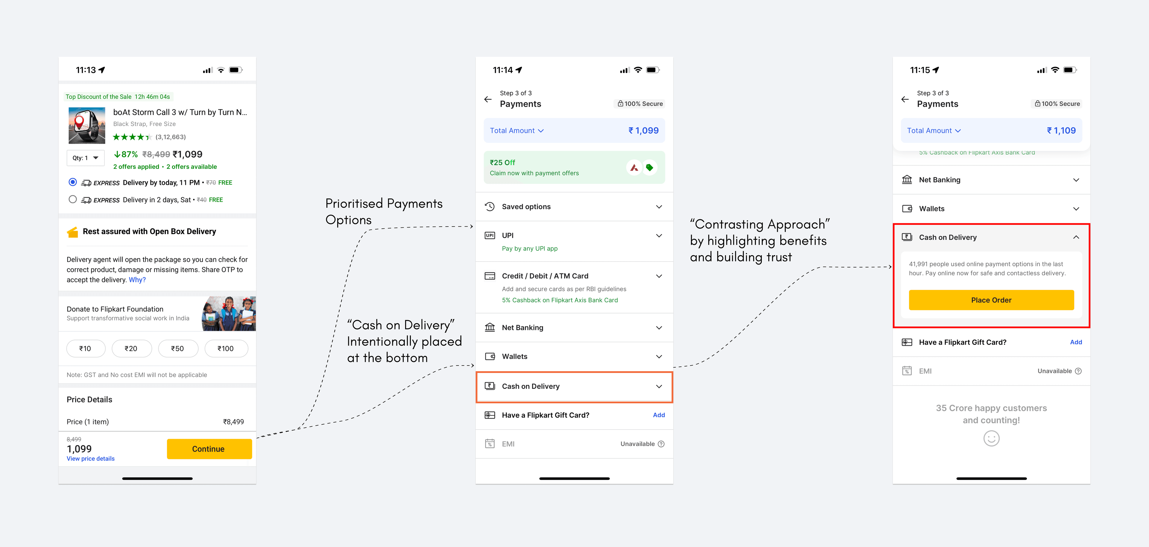
Let’s understand this better with an example. Flipkart’s strategic use of negative friction in the COD process promotes online payment adoption, benefiting both users and the platform's operational efficiency.
Flipkart provides users with payment options, including online and Cash on Delivery (COD). Users opting for COD go through an extra step to confirm their order through a captcha or in some cases, they may even call the user. By adding these intentional steps Flipkart deliberately makes the COD process slightly less convenient than online payments.

To help users understand the benefits of online payment, they take a contrasting approach by providing information like “X number of people had used online payment options in the last hour” next to the Cash on Delivery button
By showcasing the advantages of online payments, such as faster order processing, immediate payment confirmation, digital receipts, and enhanced security measures they subtly nudge users towards this option, which aligns better with modern digital transaction trends.

Transparent communication about the ease and security of online payments, combined with highlighting the benefits users gain, builds trust with users and fosters loyalty to the platform. This educational approach reinforces user confidence in digital transactions and encourages the adoption of online payment methods.
Designers and product teams can draw valuable insights from this strategy. Introducing intentional friction points with transparent communication about the benefits of preferred actions can guide user behavior in the desired direction while maintaining a positive user experience overall.
As we navigate the complexities of user interactions, let's remember that friction when applied thoughtfully, can catalyze positive change, drive adoption of preferred features, enhance security, and ultimately enrich user experience. By embracing the dual nature of friction and leveraging negative friction strategically, designers can craft experiences that exceed expectations in an ever-evolving digital landscape.
At Cyces, we specialize in UI/UX design strategies that leverage negative friction to drive user engagement and product success. Our user-centric approach focuses on identifying key friction points and strategically implementing negative friction to guide users toward desired actions while maintaining a seamless user journey. We excel in crafting friction-inclusive designs that balance usability with intentional obstacles to enhance security, encourage responsible user behavior, and promote desired interactions. By integrating user feedback iteratively, we ensure that our designs not only meet functional requirements but also resonate deeply with user expectations
Read more:
leveraging tech for
business growth
Cyces.