
growth
We build things at Cyces. And one of the things we build are websites. More specifically: We want to build websites that will grow your business. To put it crudely: Websites that give you leads.
It sure is enticing to talk about CRO, and every other technique that helps you harvest leads. There are hundreds of articles about what button colours convert users better. (Full confession: We ourselves have written about it here). We’ve changed the colours of a website, played around with CTA placement, and added a flashy GIF here and there. All in the hope of getting leads. And in the process, we got lost in the details.
⚠️We failed to understand a fundamental question: What is the one thing a website should do?
Here is a snippet from the 1999 website of 37Signals the company that built Basecamp. Among multiple other inspirations, this gave us the most clarity.
B2whatever Other companies talk about the importance of designing for the B2B, B2C, C2B, or B2C2B market. We don't. The truth is corporations don't use web sites, people do. B2whatever, we'll design a site that works for the person on the other end.
We then broke it down further. When will a site works for the person on the other end. When a website builds trust.
We then got down to study how websites we love built trust in the minds of the user. Thanks a ton to Web Archive (for all the screenshots from the past), and the people who built these websites over the years. For uniformity, we have chosen to look at websites from 2012-2022.
Basecamp is a project management tool which we at Cyces use to manage our multiple endeavours. It has proven to be very effective for our website projects since they require constant communication with the clients.
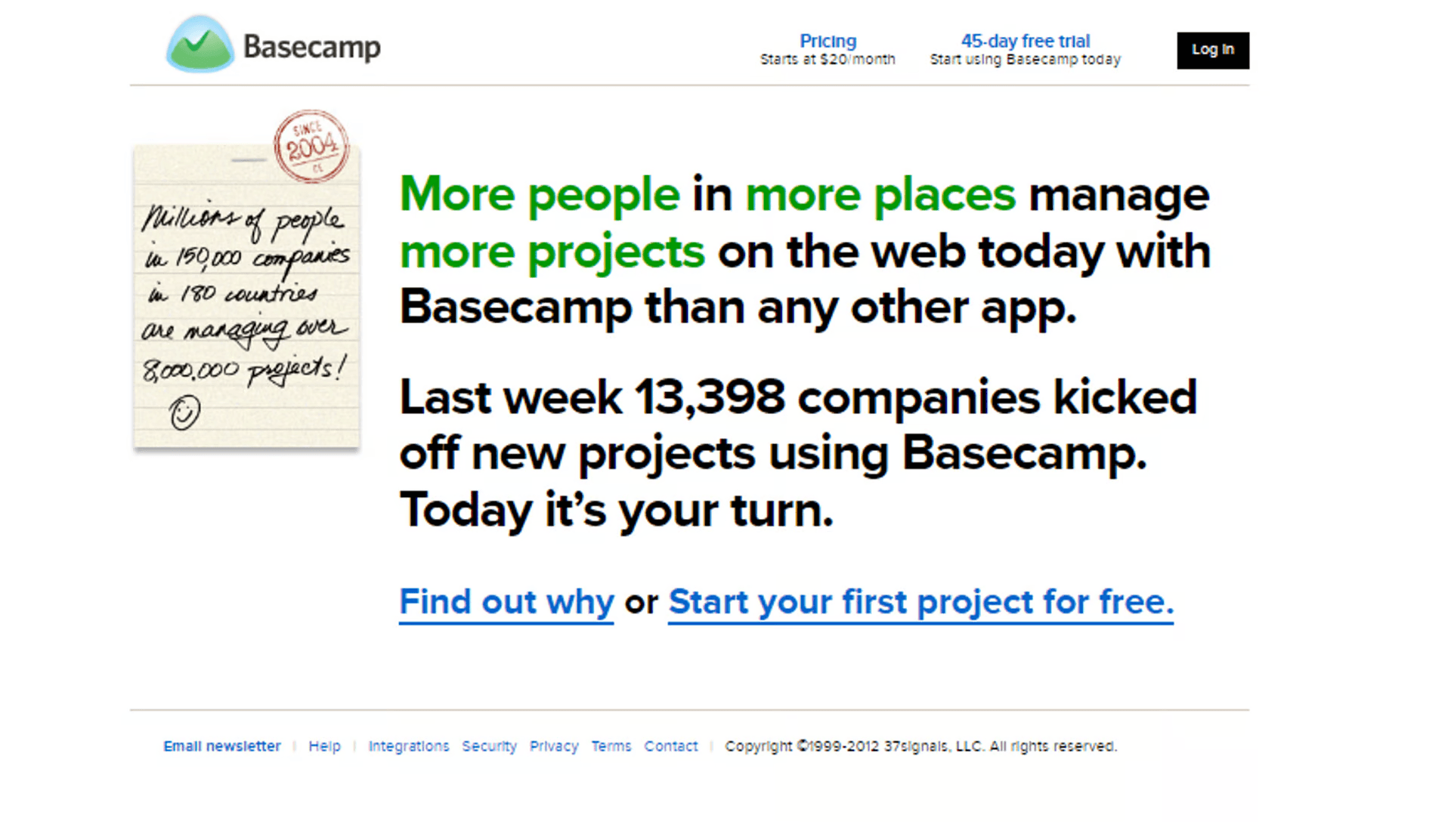
This is a screenshot from 2012, the year when London hosted Olympics. I now look at these snapshots with the one question in mind. “Which one of these elements builds trust?”. It sounds corny, but with Basecamp, almost all elements further the cause of trust. “Last week, 13,398 companies” started using Basecamp. About 13,000 businesses could not be wrong. Then, they emphasize it further. Millions of people in 150k companies use Basecamp — since 2004 (notice the rubber stamp).
When it comes to showcasing testimonials, Basecamp does not hold back.
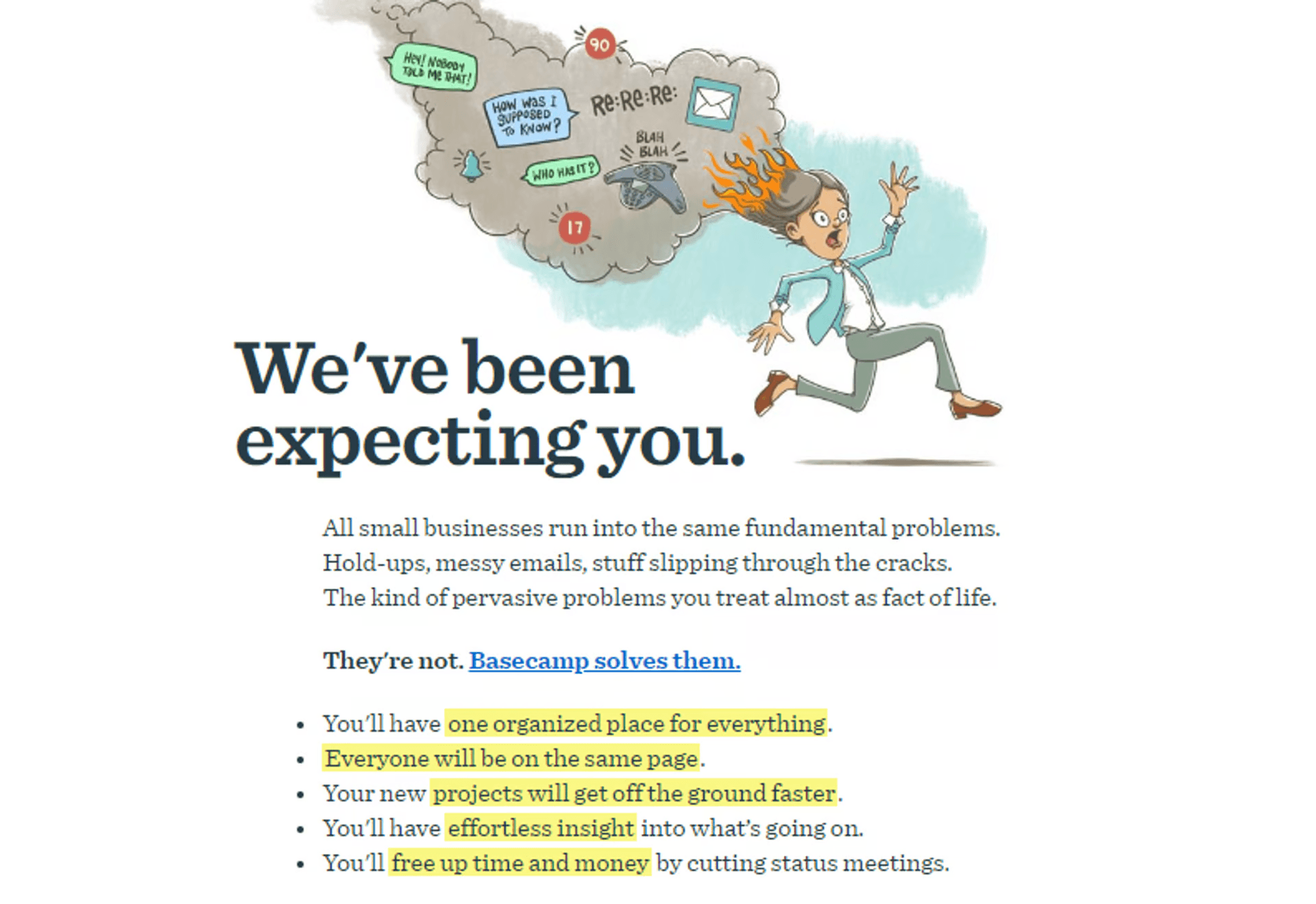
Here are some snapshots from 2017. Gotta love this illustration. Here, Basecamp captures painpoints in design, and their content. Their primary customers were small businesses. And they have laid out every problems such companies face. This means, Basecamp knows their customers quite well.
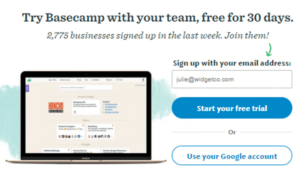
I added in this screenshot from the same year. Basecamp retains some UX elements from 2017! It has displayed the number of businesses that have signed up in the last week. In fact, this stays on, even today.
The attention to detail: The yellow highlights, the number of notifications that keep increasing (in the smoke from the busy working woman’s head), and the copy below which clarifies that you can add team members for the free trial period.
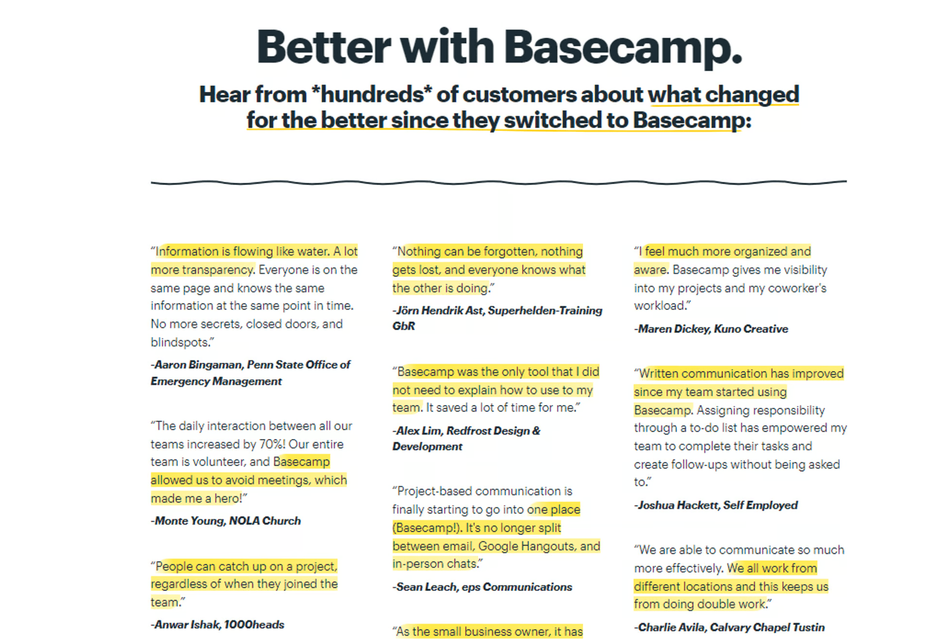
This is now, in 2022. Basecamp displays hundreds of quotes from its happy customers. They display messages from business owners with whom a user can relate to the most. Their testimonials page is not a bunch of high-profile logos. Here is another page which we refer to quite often at Cyces: https://basecamp.com/before-and-after. It always comes up during design conversations.
What we learnt:
This, is again from 2012. When Hubspot was positioning itself as an ‘all-in-one marketing software’.
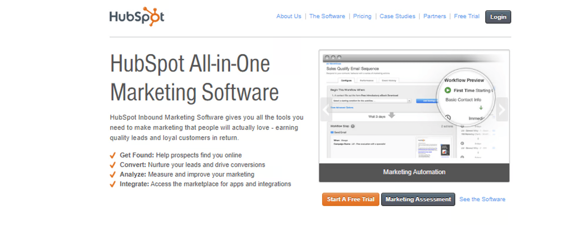
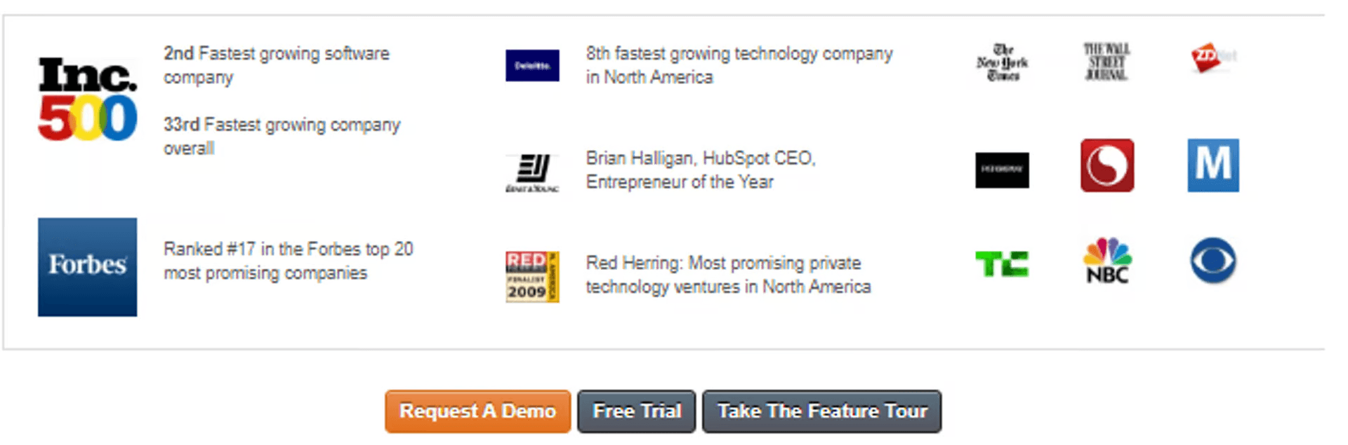
Hubspot has also went all out with its awards, press mentions and its testimonials (not captured here). The testimonials mention numbers: “550% increase in organic traffic”. There is another block advertising ‘World’s Largest Webinar” on Inbound Marketing.
(Notice the CTAs)
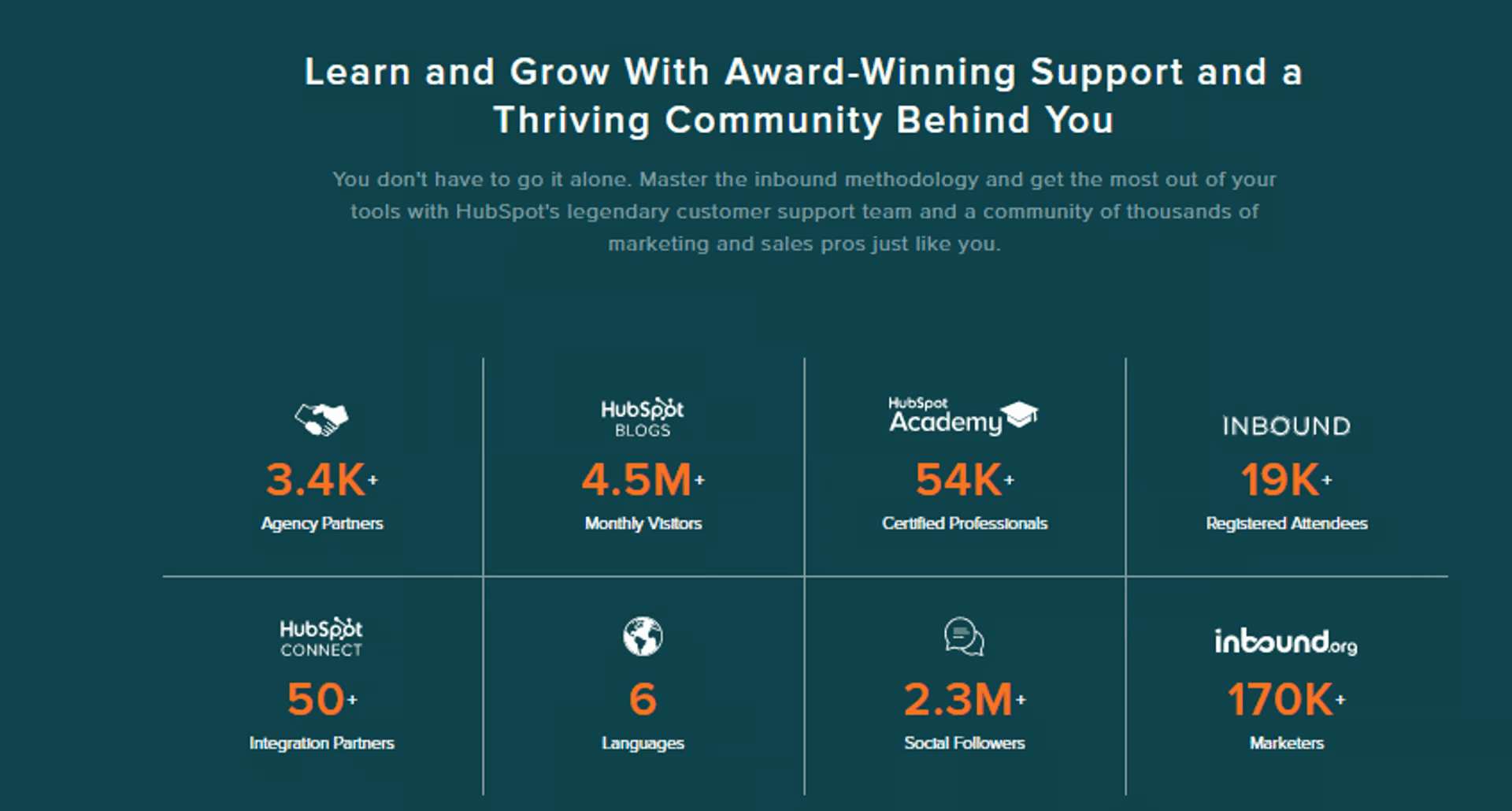
Hubspot were pioneers of Inbound Marketing, and there is the classic need to educate an audience. Here is a screenshot from 2017, when they showcase their expertise in Inbound Marketing. Their blogs fetch millions of monthly visits, and 54,000 professionals got their certificates from Hubspot Academy.
This was their landing page hero text in 2017: 'GENERATE LEADS, CLOSE DEALS & MANAGE YOUR PIPELINE WITH THE HUBSPOT GROWTH STACK’. Hubspot’s websites have been sharp and concise with their messaging. For a salesperson/marketer — their userbase — the pitch is crystal clear.
Now in 2022, Hubspot stays as clear as ever. They have retained the above shot even today, with more impressive numbers.
What we learnt:
Rowing is a straightforward sport. You just have to make the boat go faster. While training for the Sydney Olympics in 2000, the British rowing team punctuated every activity with this question ‘Will it make the boat go faster?’
“Should we go to the pub tonight?” Will it make the boat go faster? “Should we have eggs for breakfast?” Will it make the boat go faster?
Here is the full thread:
We now try to apply this at Cyces. Before putting an element on a website, we ask: “Will it create trust?”
Note: Cyces builds websites under its division Freshboost. Check out its website here
Read more:
leveraging tech for
business growth
Cyces.